
Messenger Kids iPad
In 2020, it was time for this kids’ app to grow up a little. We introduced a new design system that was more aspirational and felt like an app for older kids; an app that kids could feel like they could grow into. It was a success, garnering positive to neutral metrics with the change. It made sense, then, that we would port the same system over to tablets and expect similar results. The results of the data, however, showed us we missed the mark.
We failed to consider that the average age of our tablet users was younger than that of our mobile users. It was clear we needed to develop a system that was friendlier to our youngest users, so we set out to learn from and design with some experts... kids!
My Involvement
I was brought on to lead the design update for iPad. I worked closely with User Research to develop a test plan to understand just what was not working with the latest iPad version. I developed hypotheses and concepts for possible solutions for these problems. Working with User Research again, we developed a co-design experience with some 6-8 year olds to see what features felt most important to them and which solutions resonated best.
In the end, we had a new system that addressed several of our biggest pain points. The final design was measurably and qualitatively better by introducing clearer affordances for tapping and scrolling, better use of the larger iPad real estate, and introducing users to standard UI patterns through labeling and animation.

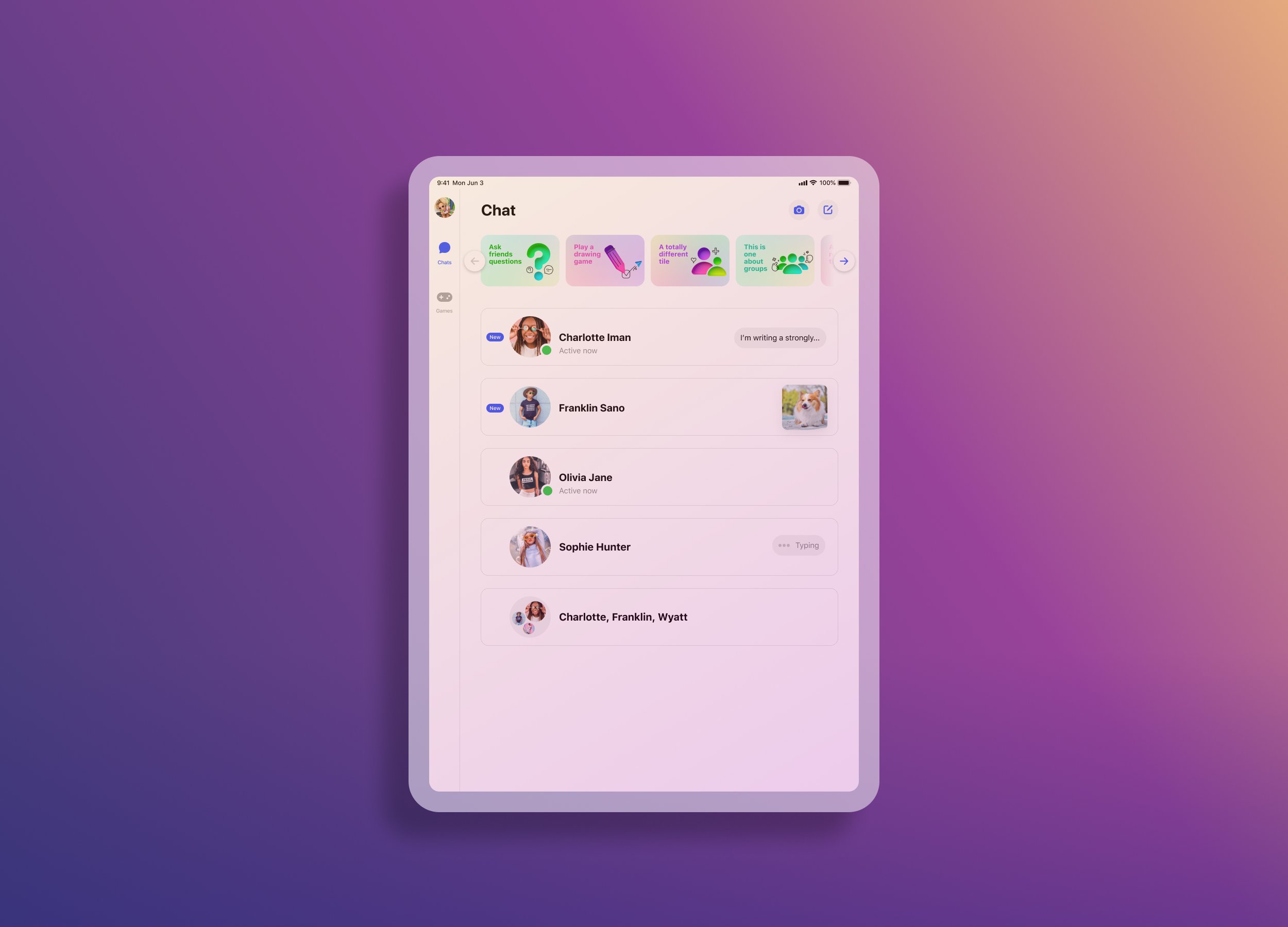
The new Messenger Kids design system as originally applied to iPad. It had a number of issues that our youngest users had trouble with; unclear affordances for tapping and scrolling, unlabeled and ambiguous iconography, and suboptimal use of real estate.

Our panel of expert app designers working with me and UX Researcher, Justin Van Ness, to co-design a new messaging app for kids.

The elements we presented to kids to help us understand what visualizations resonated best with kids and what was most important for a messaging app in their minds.
The original unread message badge (blue dot on the left) is a standard UI pattern we see in Messenger and Apple Messages. Kids, however, have not learned this pattern, so for many of them, this badge meant nothing and was often ignored, leaving unread new messages on the table. The design solution on the right labels the badge to give it contextual meaning for kids who can read. For kids who cannot, the fun, squishy animation draws the eye, alerting them of something they should check out.

Our final design solution solved for tap and scroll affordances, teaching UI patterns through labeling and animation, and taking advantage of the larger screen real estate.